Wednesday 8 December 2010

Production for visual communication

Who is your favourite expert?
My favourite expert is Paul Rand because of his ability to communicate complex ideas in a simpler form. This shows his understanding of what the audience wants. His designs are very clever, consisting of symbols and images that are computer based. He specialises in advertising. The image below is a good example because of its clear use of symbols, which easily communicates each letter. He has chosen bright colours on a black background which helps the logo stand out. It is a very well known image, and because of its simplicity it is quick and easy for the audience to read. He clearly understands form and function and what to aim at an audience.


When and how was the first ever book in Europe printed ?
Looking into the first book that was published. a brief introduction into print making, looking at who created the first book. The problems he occurred along the way, how he problem solved. the development of books from 1300.Johannes Gensfleisch zur Laden zum Gutenberg?It was 1455 when the first printed book came off of the newly invented "fixed-type" press, known to us as the Gutenberg BibleGoldsmith Johannes Gutenburg.
Guttenberg Bible2.jpg

Gutenberg was the first European to use movable type printing, in around 1439, and the global inventor of the printing press. Among his many contributions to printing are: the invention of a process for mass-producing movable type; the use of oil-based ink; and the use of a wooden printing press similar to the agricultural screw presses of the period.

Text used in images

How can you add text to change the meaning?
Looking at Laura Wilson
Richard Avdor
When using text with an image it can completely give another meaning. The image can be out of context without the use of text.
examples.

How text generate emotion?
Generating emotion through texts. How does text influence you as an audience. Looking at the way text can manipulate an image. It can change the whole meaning of an image. An image can be completely reliant on text. Generate great emotion. It can create a lot of empathy because of text that has been used…find example…

How does text effect the meaning of an image?
Text can effect the meaning of an image because the context can completely change. An image can be powerful enough without needing text, however some images need to be backed up with text if the image wasn’t strong enough to work on its own. It could even be that you want to limit what the audience sees. By adding type you are restricting the viewer from seeing anything beyond what they want  you to see. Need examples of work….
Looking at the experts- what has influenced me..show examples. Show examples in rvj Looking at Richard Avdor, his images are so powerful that they don't need text. They stand strong enough on there own. If i was to add text to the image below this would immediately detract from the impact. The context has been left up to us to decide which in this case is good as it doesn't limit you. This could have a story behind it, which has been left to the viewer to create. Images like this can work with and without the use of text both, this could easily be photography for a hair advert, this straight away changes and manipulates the meaning of the image.

Sunday 28 November 2010

Managing a creative environment

Managing a creative environment
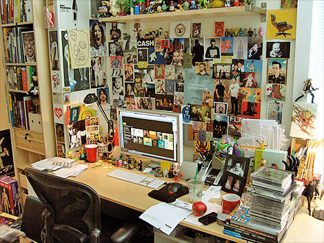
I like to surrounded by a lot of objects that I feel inspire me to work. I have always worked in a cluttered environment as I feel this encourages my creative thinking. The space that you work in should reflect your certain style and interests as a creative practitioner. Its all about remaining creative within your work space and being able to come up with fresh ideas. By collecting certain objects that are going to influence your work, you are able to use your surroundings as a base for new exciting ideas. The environment could be covered in your favourite artists, objects that you have collected or even work that you have done. All of these are important in helping stimulate your mind, keeping up with fresh contemporary ideas but sticking with your style and influences.

You should be able to tell a lot about a person judging there surroundings. Also looking at the way they work, small, big, on the floor. these are important to take into account. What you work best with, the environment that you feel most comfortable with.


Overcoming mindsets
Overcoming mindsets is all about having the ability to problem solve. It is about challenging traditional patterns of thinking, which will then enable you to keep your ideas fresh.

Tuesday 16 November 2010

Production and outcomes

How do illustrators amplify the meaning within a message?
Need to know what is going on in the world as the message you communicate needs to be relevant to our time. You as an artist have to have an understanding into historical content. It is a personal, subjective interpretation of the notion of time and place.
little-red-riding-hood


CAMPARI


Gustave DorĂ© illustrated very dark fairy tales and other mystical stories. It is done purely in black and white to create a more sinister atmosphere. His dark style shows that is may not be aimed at young children. He has taken a serious approach when illustrating this book as he has gone for a more sinister feel. The dark tones and grainy style really creates an atmospheric feel to this image. His drawings are very realistic which would maybe appeal to an older audience. You have to take into consideration what the audience at the time is into. In this case because it was done in Victorian times a traditional sketch.

This image is definitely been modernised to keep with the times of society, using a well known fairytale to sell certain products. It has been updated as they have used a woman instead of a child so we know this is aimed at an older audience. The chain around the wolfs neck suggests that woman have become stronger over the years as she is the one in control. It is highlighting fashion aswell as the product. This is definitely keeping up with modern day times as its vibrant colours and modern twist really keeps this fairy tale up to date. These images are very different, even though they are both about the same characters. This shows that over time you as an artist have to adapt styles and techniques to keep up with the changes in society.

Delivery
Looking at certain artists that have taken full advantage of advertising themselves as artists. This is looking at the way they have got themselves noticed , through creating a website, getting there work produced in magazines, books. Looking at the way they have used creativity in showing there work. Using different ways of advertising, giving them an edge and showing people that they are unique in what they do. Drawing on walls. Banksy is a good example of this. He uses walls on streets as a platform for his work to be recognised. His political approach really attracts a lot of people, creating a lot of controversy. His work involves taking risks, which i feel has paid off. The stencils vary in size, making every image different and unique.

Its about being able to sell yourself, getting yourself noticed. Even though Banksy has remains anonymous over the years, his work is strong enough to

Development in ideas and structure in moving image

Story development:the three act structure
"Every movie needs to have a begining, middle and end, but not necessarily in that order" was a quote from Jean Luc Goddard. Looking at Atonement I found this quote very true. Normally films have an equilibium-diequilibrium-equlibrium. This is where harmony at the start becomes a crisis by the middle but harmony is restored by the end of the film. In film it is broken down to Establish:Crisis:Resolve.


The plot changes when, Briony Tallis, a 13-year-old girl from a wealthy English family lies about a rape, resulting in an innocent man being sent to fight in the war. The middle consists of cecilia and Robbie fighting to be reunited.
Even though the two main characters die before they are reunited, Bryony hopes that by reuniting them in fiction, she can give them the happy conclusion to their lives that they have always deserved. This isnt a typical example but found it facsinating that they were able to conclude it, because of how strong Bryonys character was. She was the one that had all the power to put things right, giving her the role of a protagonist.
Paul Marshall-antagonist

Drawing by hand

Drawing by hand
Drawing by hand is essential as it helps you express your creative side in different ways. It helps you solve problems through drawing processes. When approaching an idea, it is best to keep your mind stimulated by expressing yourself through visuals. "I love drawing. I'd quite happily draw on anything (and quite often do) but some hot pressed Fabriano paper or a Moleskin notebook are my surfaces of choice." This is a quote from Jill Calder, looking at her work I found her sketchbooks were a very important base for her ideas. Her drawings are very childlike and quick which I feel works really well. She does a lot of observational drawings which help her develop ideas. By using different medias she shows she is always looking at life through fresh eyes. Experimenting at all times, exploring different medias and mark making enhances your drawing skills. By exploring all areas in depth you will become more inspired by things around you.


An RVJ is crucial in being able to explore and generate ideas. There is no right or wrong when creating a RVJ as this is personal to you. By using a book to put your ideas down you are going through a journey, learning new skills and being able to grow in confidence with your sketches and ideas ."Notebook after notebook after notebook because I feel sick when I forget  potentially good ideas"-Paul Davis. Ideas should always be expressed through visuals as thinking on the page helps develop ideas.

Utilise your creative brain
In your head there are two brains that carry out different functions in different ways. You can improve creativity by utilising these functions. To allow the right brain to explore direction it needs to have a general intention. While being creative you have to be able to use both of these function in order to communicate either your ideas or drawings. a drawing can't stand alone, it needs a meaning behind it. I chose this example of a RVJ as it is in the form of a brainstorm. I thought it was an interesting mix between sketches an writing ideas down.

Monday 25 October 2010

Tone of voice

Visual Hierarchy
It is very important when advertising to have all the key elements that draw an audience in. There are different fonts, colours, visuals to take into consideration. You have to be aware of where the audience will look first. 
I feel this does lack a lot of visual hierarchy as they have kept it very simple. By keeping it simple they have been able to make the information much more clear but isn't very pleasing to the eye. You have to take colour, font size, capitalization and imagery into consideration when communication to an audience. The red black and white goes really well together as they work as a contrast. Having Max Payne in a bigger font helps highlight the main selling point of this magazine. It also has to take into consideration its target audience and steer it towards this. Although the word Gaming is in the same sized font as Max Payne it doesn't quite have the same impact because its not in the colour red. Visually it is not that pleasing but does the job. Using a James Bond image and guns connoting danger will draw a lot of people who have these interests in. Overall this lacks a lot of visual hierarchy because of its lack of communication and aesthetics but is still working hard in aiming at its target audience.


Critical commentary on legibility
In visual communication having something that is legible is very important. You have to think very carefully about the lay out of your typography, and if it is readable by the audience. You also have to think about colour and whether certain colours you use go well with the background. An example of this would be not to use a yellow font with a white background as it becomes very hard to read. When creating a piece of advertisment if being on a magazine or book, then you should take into consideration wether the writing is legible, looking at the size of the text.


This example on the left is very hard to read, even though it is black on a white background the choice of font is not clear atall. This shows you have to be very careful when choosing the size and style of the writing you are trying to communicate. These two examples show what you should and shouldn't do when trying to communicate to an audience. The image on your right is clear, with a light background that helps you focus on the writing. The colours also help highlight the letters, as they have chosen vivid colours and a basic font.

Wednesday 6 October 2010

What is the role of an audience?

What is the role of an audience?
The audience is a key factor to think about when creating a piece of art. An artist would have to take into consideration whether that audience will be able to engage with the piece and enables the artist to think how we can communicate through visuals. Without an audience we would not have a market for selling, or a particular style you are trying to aim for. As an artist you have to live up to the expectations and standards that have been set. An understanding of an audience can enhance the communication between them and the piece they are looking at. Once you have gained knowledge of this you are able to relate to your target audience. Its about how the audience reads the message within the visual. 

New art is being created on a daily basis, not because we necessarily need it, but because people are evolving everyday. Art only reflects the issues and emotions of our era and this then changes as the audience change. The artist initiates the conversation with the audience as it is important to be able to relate to them.


Why is research important?
Through the visual practice of observation, collecting, studying and exploring, illustration can contribute to a deeper understanding of the subject. When looking in-depth into something you want to communicate to others the best way of going about this would to be thorough in your research. Always looking into different ways of getting things across the best you can. Exploring and experimenting with different media can help as you start to work within the medium you feel most comfortable with, which then can improve the way you work as a whole. Observing what is going on around you is also very important as you gain a greater understanding of life, which will help you communicate this in the form of illustration. It gives you a deeper understanding of the subject when you know what you are trying to communicate to others. 

A good example of this would be illustrator Paul Davis who is very passionate about experimenting and writing down ideas in his sketch books "Notebook after notebook after notebook because I feel sick when I forget a potential idea". Paul Davis develops language and reflects himself in his quotes. His sketchbook work consists of  lots of observational drawings, documentation and experimentation. Research plays a big part in how you, as an artist, works.Collecting something small could be the start and inspiration to create something big

Tuesday 5 October 2010

notions of originality

Notions of originality
Is there such thing as originality?Without knowing the history of art how do we know what is original and what has been manipulated to become more contemporary. Unknown artist - Gabrielle d'EstrĂ©es - c.1594 this painting was recreated several times. Melanie Manchot – The Fontainebleau Series – 2001, using different style, photography. using different genres, more sexual. Looking at when this painting was first made, had a different impact to society than it would now.
A traditional painting from 1594 would have been painted for personal use. whereas the other images are much more contemporary, they would be seen in everyday magazines, aiming at a different type of audience. Visual elements such as the two ladies being naked has a very big impact, especially in the era it was painted. The nipple tweaking is supposed to represent Gabrielle’s pregnancy with the King’s baby and is symbolic of her fertility. The context of this image has completely changed as it is now being used to advertise perfume. Sorrenti has used a photograph to make this famous image become much more contemporary. Having the man topless but Kate Moss still having her top on leaves a lot to the audiences imagination, which in this case works well as a selling point. The audience it is targeting is also very different, as the piece has been commercialised. By using Kate Moss we now know this has been carefully thought out to engage its audience. Using a man and a woman also makes the image more sexual and shows how open people are about sex in our society now than in 1594, has a deeper meaning behind it. shows how shallow society is now, using sex to sell a product. Also using Kate Moss as the main selling point to pull the audience in.


Can recontexualised ideas be contemporary?
To keep artwork fresh and contemporary you have to keep up with society. To make a piece contemporary you have to be thorough in your research, this anables the audience to relate to it. You have to know what is relevant at that time to be able to communicate to the audience. The concept is very important as it had to be able to reach a certain audience and genre.

An example would be this piece by Peter Kennard - The Haywain. Here you can see he is manipulated the image to replace what was a very tradictional painting into something that is relevant to now. Here Peter Kennard combines two exsisting images to create a critical new meaning. He takes John Constables painting The Hay Wain (1821), an idyllic image of East Anglian countryside, and places three nuclear warheads on the haywagon. This completely changes the concept of this image and it becomes iconic in a different way. There is such a strong contrast in this image which enables the message, Peter Kennard is trying to put across, to stand out.